
Part 2 of the "Building My AI Networking Tool" series
There's a seductive narrative around AI development: "Just describe your idea and watch it build itself."
I've built multiple apps over the past decade. I know better.
But I also know this: The work required to build with AI is different from traditional development—and in many ways, more accessible—if you approach it strategically.
This post is about that strategy. The planning that happens before code. The decisions that shape what AI builds. The editing mindset that turns AI's output from generic to yours.
Because here's the truth: AI won't ask questions. It will fill gaps with assumptions. Your job is to minimize those gaps through deliberate planning—or be prepared to edit ruthlessly.
It's incredibly tempting to feed AI a broad idea and let it rip:
"Build me a networking app that scans business cards and generates follow-up emails."
AI will build you something. Probably something that technically works.
But what you won't get: an interface designed for your specific workflow, error handling for real-world edge cases, a visual style that matches your brand, or components organized for future iteration.
The gap between "AI generated something" and "I built something useful" is planning.
And planning with AI is different from planning alone. You're not just deciding what to build—you're teaching AI your vision through structured context.
Before writing a single line of code for this networking tool, I spent time with AI having strategic conversations:
Talking through the problem:
Exploring technical approaches:
Mapping the experience:
This isn't me figuring things out alone. This is me working with AI as a thought partner—one that has expertise across OCR, mobile development, API design, UX patterns, cost optimization.
You're not just getting one expert. You're getting dozens of specialties in conversation with each other.
For this networking tool, planning happened in layers:
Confirmed this isn't just my pain point. Talked to other business owners who network. Validated the workflow interruption.
Listed everything this could do. Ruthlessly cut to three essentials:
Everything else? Future iteration.
Created mockups in Figma:
This isn't just aesthetics. This is defining what "done" looks like so I can tell when AI drifts.
Before building any screens, I defined the foundation:
Typography:
Colors: A deliberately minimal palette:
The intent: Make it feel approachable—techie enough to signal capability, but not so technical that it intimidates. This is an extension of my Hite Labs branding, which already walks that line between professional and human.
Spacing & Components:
What is a design system?
Think of it as the visual grammar of your app. Just like you wouldn't write a book where every chapter uses different fonts, margins, and punctuation styles, you don't build an app where every screen invents new button styles and colors.
A design system is your constraint set—the rules that make everything feel cohesive even as you add features.
Why it matters with AI:
Without a design system, AI will invent styles on every screen. Blues that don't quite match. Spacing that varies randomly. Components rebuilt from scratch each time.
With a design system, you can say: "Use the light blue. Use h2 styling. Use the button component." And AI has a reference point.
Breaking the vision into buildable chunks:
Each story becomes a clear instruction set for AI.
This planning isn't wasted work. This is the work. Code is just the artifact.
With planning complete, I started building. First up: the design system.
I gave Claude Code the user story with my deliberately minimal specifications:
"Create a design system:
What I provided: ~6-7 colors, 2 fonts, essential components only.
What AI generated:
To be generous, some of what AI added could be seen as "iterating" on what I provided—expanding the foundation with common patterns.
But most of it? Red herrings. Components I didn't invite to this party.
Where did those come from?
AI's training data. When you say "design system," it pulls from thousands of design systems it's seen—most of which are comprehensive component libraries for large applications.
My design system was intentionally minimal. AI assumed I wanted comprehensive.
Here's the shift that makes AI development productive:
You're not writing code line by line anymore. You're editing.
When AI generated that design system with wrong colors and uninvited components, I didn't start from scratch. I switched mindsets:
From: "Build exactly what I specify"
To: "Generate material, then I'll cut and refine"
I went through the CSS file systematically:
This felt like editing a draft, not debugging broken code.
The structure was sound. The organization made sense. I just needed to remove the assumptions and align it to my actual vision.
And it was still 3-5x faster than writing from scratch.

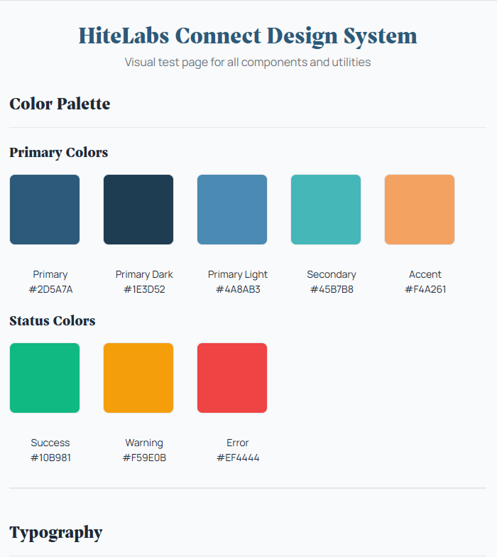
Design System - First iteration: Claude Code created an overly complex design system with a blocking modal as the default state. The fonts were generic, colors appeared random, and the modal prevented interaction with the rest of the interface. A hodgepodge of components that looked more like a UI kit demo than a cohesive design system.

Design System - Updated Fonts
After prompting to remove the blocking modal and improve typography, we got a cleaner layout. The fonts were updated to something more professional, and the modal was relegated to a button-triggered example. Still generic-looking with a standard design system feel, but more usable and organized.

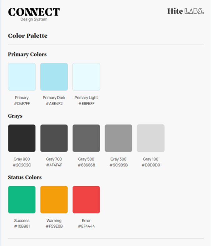
Refined Design System tailored to my needs
The design system finally reflects Hite Labs Connect's brand identity. Correct background colors, proper header styling that connects to both the Connect product and Hite Labs branding, and a complete gray scale palette alongside primary and status colors. Clean, professional, and ready for development.
The visual difference is clear. But more importantly: the edited version is maintainable. Every color has a purpose. Every component serves the actual app. Nothing extra to confuse future me.
Through building this, I've learned when to be fastidious and when to let AI improvise:
Be specific about:
Let AI handle:
AI is excellent at "known good patterns." It's terrible at "your specific vision" unless you teach it that vision through context.
Once I had the design system edited down to my vision, I started building the actual screens. This is where Claude Code's queue feature became invaluable.
Example: The form inputs
I knew I wanted form inputs with:
Here's what's worth noting: I didn't specify every state in my mockups. I just designed the basic input structure, knowing that states like focus, hover, and error should exist.
And I was right. AI knows these states exist and created all of them for me automatically. That's the power of AI having expertise baked in—it knows form accessibility patterns.
But the nuances were off:
Old workflow: Fix border. Wait. Fix focus state. Wait. Fix error color. Wait. Each change = stop, execute, review, repeat.
With queue: I spotted all 5 issues, typed all 5 corrections, and Claude Code processed them sequentially. No waiting between each one. No context switching. Just: identify problems → queue fixes → watch them resolve.
This transformed iteration from frustrating stop-start to fluid refinement.
When you're making 15-20 small adjustments to get something pixel-perfect, this isn't just convenient—it's the difference between spending 2 hours vs 30 minutes on polish.
Building apps isn't hard in the sense of requiring rare genius.
It's hard in the sense of requiring:
These are learnable skills. Not gatekept knowledge.
The barrier isn't your ability to code. It's your willingness to do strategic work before asking AI to execute.
If you've never built an app before, here's what's changed:
Old barrier: You need to learn programming languages, frameworks, deployment, databases, APIs—before you can build anything useful.
New reality: You need to learn to think clearly about problems and articulate your vision—then AI handles the technical execution.
The work shifted from syntax to strategy.
You don't need to know how to write a React component. You need to know what that component should do and look like.
You don't need to understand database normalization. You need to decide what data matters and how it flows.
AI fills the technical gaps. You fill the vision gaps.
That's why planning matters. That's why mockups matter. That's why design systems matter.
Not because they're bureaucratic overhead—but because they're how you communicate your vision to AI in a language it can execute on.
Here's the rhythm I've settled into:
1. Define the slice What's the smallest complete feature I can build and test?(Example: "Camera opens and captures photo")
2. Create the context
3. Let AI generate Give it the context and let it build the scaffolding.
4. Edit ruthlessly Remove what doesn't fit. Refine what stays. Add what's missing.
5. Test in reality Not "does it work on my laptop" but "does it work on my phone at a networking event?"
6. Iterate based on what breaks Real-world usage reveals assumptions you missed.
This loop works whether you're experienced or not. The difference is experienced builders know what questions to ask in step 2.
But AI can teach you those questions if you're willing to learn.
Since user stories are the bridge between planning and building, here's what mine look like:
User Story 0: Development Standards
User Story 1: Project Setup
User Story 2: Design System
User Story 3: Header Component
User Story 4: Camera Capture
User Story 5: OCR Integration
User Story 6: Loading & Error States
Each story is comprehensive—not just "what" but "why" and "how to handle failure."
This level of detail is why AI can generate useful code instead of generic scaffolding.
I've seen what happens when people skip straight to "Claude, build me an app":
What AI generates:
What you end up doing:
Time "saved" by skipping planning gets spent 3x over in confused iteration.
Better approach:
After the first development phase, here's what's working:
✅ Foundation Complete:
✅ Core Flow Built:
✅ Polish Applied:
This isn't about replacing relationship-building with automation. It's about removing the friction between meaningful conversation and timely follow-up.
You still do the networking. You still have the conversations. You still build the relationships.
This just makes it effortless to:
That's the promise: Turn "I should follow up with them" into "Done, email sent" in under 2 minutes.
AI development isn't about typing less code. It's about thinking more strategically.
The planning—problem definition, mockups, design systems, user stories—isn't overhead. It's the work.
Code is just the artifact of clear thinking translated through AI.
Do the planning deliberately. Let AI execute. Edit ruthlessly.
That's the formula. And it works whether you've built ten apps or zero.
Next in series: Part 3 – Voice Notes & Context (Capturing What Actually Matters)
Missed Part 1? Read about why I'm building this and what makes it different from "just prompting AI"
I'm building this networking tool to solve my own follow-up friction. But I want to know what would make it valuable for you. Below are some questions that will help me decide the future roadmap.